Custom QR code concepts
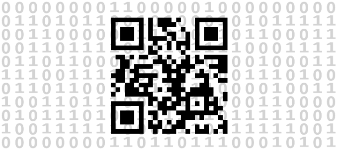
I have a new on-and-off-again project which is QR codes! I’m working on learning as much as I can about them. How do they work and how customizable they are. I want to see if I can make QR codes that defy our expectation of how they should look and if I can make mind-blowing QR codes in LEGO!
I will try in a series of posts to write in detail what I have so far learned about QR codes and in the end I hope to have multiple QR codes built in LEGO that aren’t flat black and white builds to show.
If you don’t know what QR codes are, they are 2D barcodes that can be scanned by modern smartphones. A common use for them is to communicate a web address (URL). Below is a regular QR code with the URL to this blog.
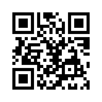
How QR-codes should look is defined by the ISO 18004 standard, but lucky for us, QR code readers usually don’t care to check that QR codes follow the standard. By trying to be as fast as possible, they do the least amount of work needed to scan and process a QR code. And we can use that to make visually interesting QR codes.
Below are a few concepts that I have developed when studying QR-codes. None of them follow the ISO standard and they are not guaranteed to work for you if you try scanning them. I asked a few friends to try scanning my concept and it has mostly worked (mostly). At worst they have had a 90% success rate.
You might need to make sure only one QR-code is visible at the time. I have included links to click on so you will only have the QR code on the screen. Sometimes you need to be close with the camera and sometimes you need to be a bit further away.
Dots and lines
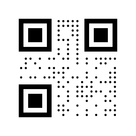
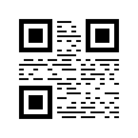
These two concepts below are two simple test designs I made to check that I understood how QR code readers worked. The QR code readers read in lines and points and don’t care to check for a bunch of perfect rectangles. As long as specific pixels are correct that is enough for them.
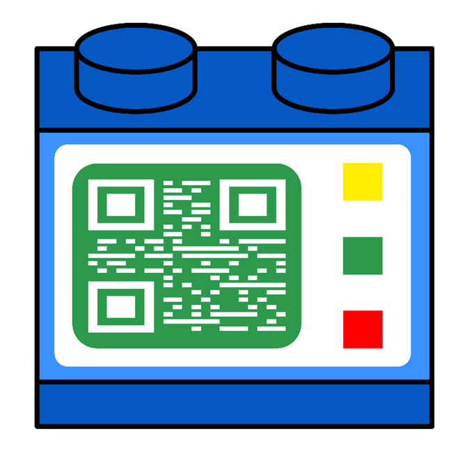
And from these two simple concepts I made these two designs below to show of what is possible to do with each one.
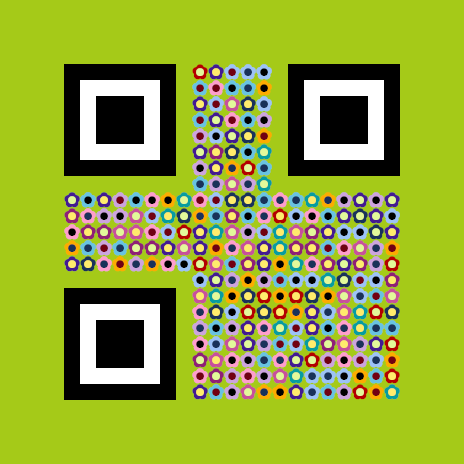
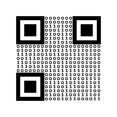
I also took the dots and lines concepts and combined them to make this design with ones and zeros. (This concept worked well for me up until recently. I believe an update to the camera software made it interpret this as text before it sees it as a QR code)
Painted concepts
Below are two concepts I drew by hand. I simply took a regular QR code then drew these designs above it.
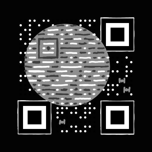
I wanted to have an exploding brick in the above one, but couldn’t quite get one right.
Modified Finder patterns
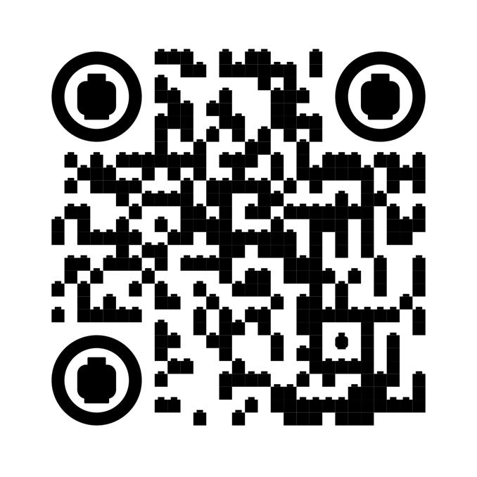
The three big corner patterns can be modified. How much I will go into in future posts, but here is a design where I used a circle and minifig head to construct them.
The design was made for a LEGO exhibition at Minivärlden in Ljungby.
LEGO versions
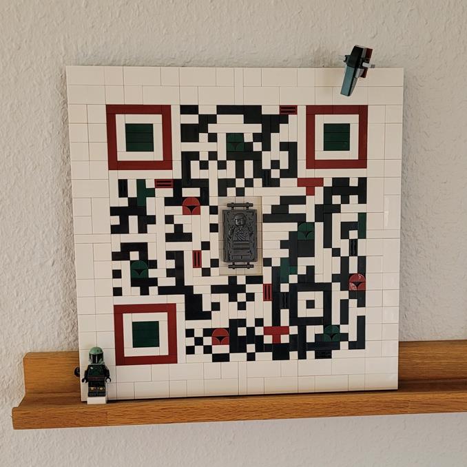
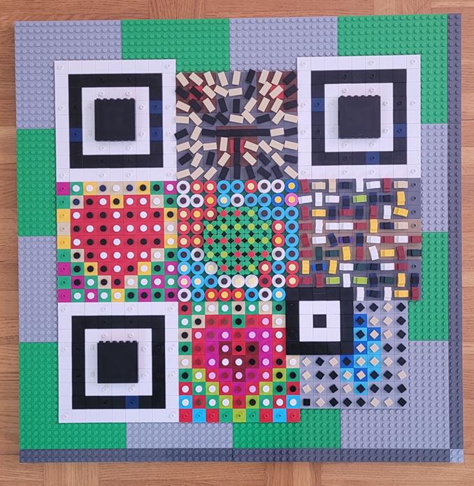
I have also had the time to make three QR codes in LEGO. The first two ones I made to make sure I understood QR codes and to check that LEGO built ones would work in practise.
In first one the built in error correction allows me to remove a part of the QR code and replace it with a carbonite Han solo piece.
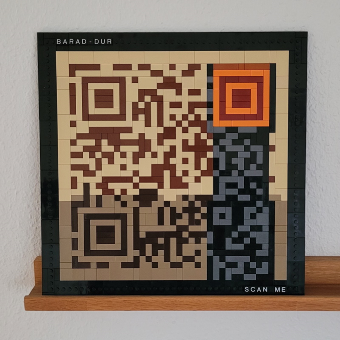
In this Lord of the Ring themed QR code I used the fact that QR code readers usually support variable lumination of the code when translating the image to black and white parts. This gave me the possibility to vary which color was used for dark and light areas.
Conclusion
The results of my exprimentations are promising. I will hopefully complete this project and write a few more QR code related posts in the future.
/Henrik

