Seaside market - Design thoughts
Thinking about lines, grouping, directions and borders.
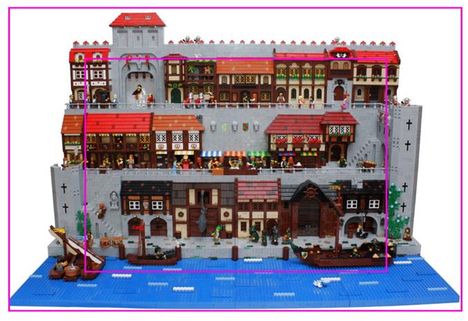
Walking around at LEGO expos and looking at big builds can sometimes be the same as looking at Wimmelbilder. The builds have lots of details, but they are disconnected and your are not sure where your eyes should go next. You end up walking away thinking you seen it fully, but in reality missed most of it. And, in worst case, there really isn’t much happening in the build to begin with. They are filled with minifigs and smaller builds that just look randomly placed and seemingly without any reason for existing other then filling out an empty area.
These experiences have gotten me to think about how to structure a big build. How to build to guide the eye and to avoid any fatigue that would make the viewer walk away before looking at everything. With this blog post I would like to go though how these thoughts influenced the design of Seaside market.
Lines
The first thing I want to mention is lines. Not just clearly visible lines, but also lines we subconsciously follow or pay attention to. Lines that can guide the viewer’s eyes.
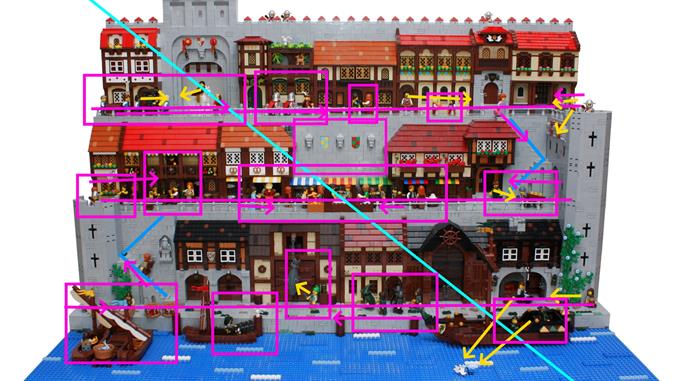
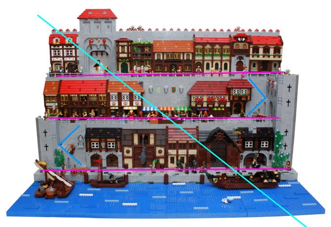
The visible lines in this build are the three streets levels. They are easy to follow and have almost all of the activity in this build. And because they are the “main paths” in this build, I felt it was important to connect them together with stairs. The stairs were placed at opposite ends so they together with the three streets would create one continuous path through out the whole build. This gives the viewer a simple line to follow to see most of the build.
The next line I selected to pay attention to when designing the build was the diagonal one from top left to bottom right. A more “subconscious” one that we commonly follow when scanning a picture. I figured we might do the same when looking at a build. This lead me to place the taller gate house and the bigger boat at opposite ends of the the diagonal. Giving the viewer something to look at at both the start and end of that line.
The “continuous path” was intentionally made to have ends at the same points as the diagonal line, so they together would form a loop.
Groups and spacing
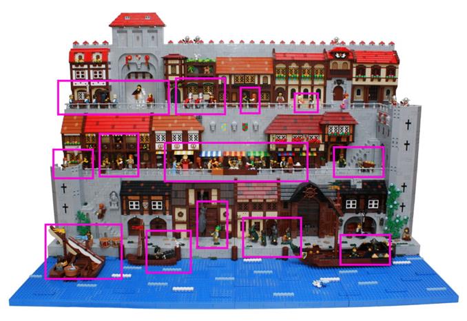
As I mentioned above, I have seen plenty of big builds with lots of minifigs that look randomly placed. Looking like they are just there to fill out an empty spot. All together it creates a mess where any added scenes easily gets hidden in all the clutter.
To combat this, I decided to organize my minifigs in groups and make sure there was some space between them. I felt that doing it that way would give more weight to each character and the group it belonged to and highlighting rather than hiding the scenes they belonged to.
Above I have marked out some of the groups in the build.
Only at the marketplace did I allow for a mess of minifigs, but that was how I wanted it to appear. Chaotic and noisy.
Directions
Besides thinking about where the minifigs should be placed, I also put thought into their walking and looking directions. If they are walking towards or looking at something in the build, I feel it helps to connect them to the bigger scene and can help guide the viewer’s eyes to something else. I have seen builds where minifigs aren’t looking or walking towards something specific and it doesn’t look good in my opinion.
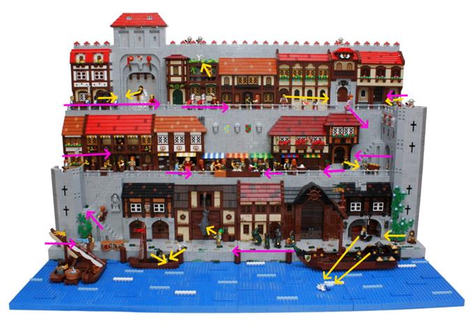
Above I have marked out some of the walking directions with arrows in magenta and some of the looking directions with arrows in yellow.
Most of the characters are walking towards the center of the build or towards the market place. Specifically at the left and right edges of the build, characters are only walking and/or looking towards the center. I did this with the thought that it might help direct the viewer’s eye back into the build so it wouldn’t trail off.
Borders
Having a nice borders/edges on a build can really elevate it. I have seen many builds made by other people that benefited greatly from having nice borders/edges. So with that in mind, I did put some though into how the shape the edges of this build.
As this build is suppose to depict a small part of a bigger city I felt I need to design something that would give closures to the build, but still make it feel like things continued on past them.
For the front I added extra bit of sea. The sea was designed in a simplistic way both because I prefer that style and because it should not distract the viewer away from the center of the build.
The back border was made by adding a city wall that rose above the houses. I did this to give a sense of that the city continued behind the houses. (This was also one of the reason a gate house was added to the build.)
Both the extra bit of sea and the city wall was thought of as fore- and background to the build. Not something meant to be consciously seen, but to subconsciously elevate the main focus of the build.
For the left and right borders, I placed two towers. I choose to let the left tower to be lower to make the build a bit more dynamic.
The quite zone
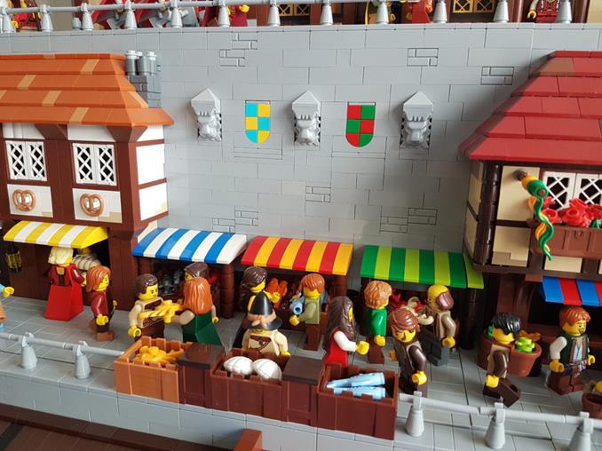
I mentioned above that I wanted the market place to be a mess. And to balance this, I decided to make the wall above it as simple as possible. Making it a resting place for the eyes, something to lessen the fatigue of the viewer. Originally I wanted it to be gray only, but when I happened to figure out the shield design, I couldn’t resist adding two of them. (The shields is the most innovating building technique in the build I think.)
But even with the shields, I think the area serves it purpose. It balances out the visually noisy market and add a little bit or harmony to the build.
Wrap-up
I has taken me long time to form these thought into words. But despite that I would like to talk more about design decision and what I think generally improves builds as I make more of them. I hope I’ll have the time to write something for each new build I make.
This is the last planned post related to the Seaside market by the way. Maybe I’ll go into detail about how the shields were made, but that is no promise.
/Henrik