The Final Confrontation
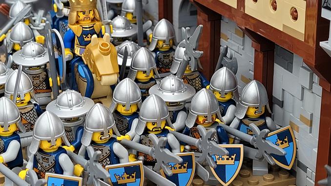
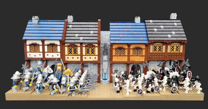
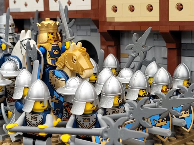
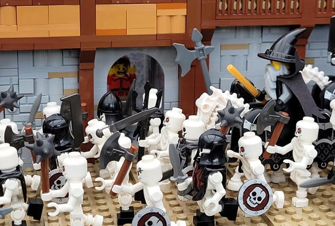
The Necromancer and his army has broken through the city’s defenses. In a last desperate attempt to stop him, the king has rallied his men for one final confrontation.
More photos on my Flickr and Instagram pages (with the most photos on Flickr)
This build is part of my “Axe legacy”-world. It shows an event that occurs after the events in chapter one.
I have been working on on and off in LDD with this idea for a while and never really been 100% satisfied with the digital result. I ended up building it anyway as I wanted to have more things to display during a summer exhibition (the one I built a portal for). It was a bit of a rushed job and I’m afraid that I’m not super happy with the result. It is a nice build, but I feel it could have been better.
What I’m not really satisfied with
Normally I don’t point out shortcomings in the things I build. If people like something I did, I don’t want to be the one to tell them they are wrong. But I would like to express my feelings about this build on my blog and to show what type of improvements could have been done to the build.
1. The angle the armies face each other.
In early drafts of this build the armies were meeting at an angle and not head on. The reason I wanted to do is that way was to have one photo where I capture both armies a bit from the front and not just from the side. The tricky part with that idea is that is would be a challenge to get everything of interest in focus. Something I could not check in LDD, but would had to experiment with real bricks and my camera before knowing exactly were I could place things of interest.
The idea was scrapped because I felt I did not have enough time before the exhibition to experiment with it.
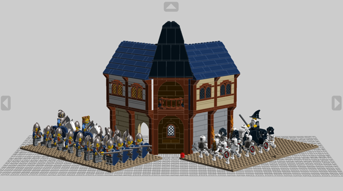
2. It is a bit small.
It would have been more epic if it was a bit bigger. It would also look cooler if the two armies were coming from several directions. It was reduced in size not just because of time limits, but because of budget constraints too. I currently don’t have enough of fitting minifigs to build the scene bigger and didn’t at the time want to spend money on more.
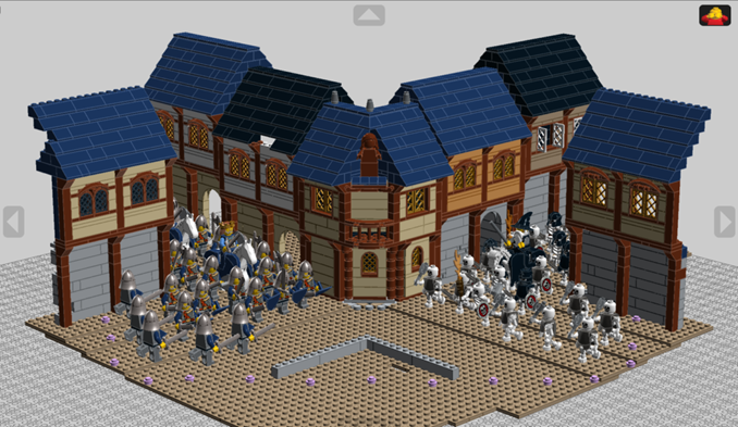
3. I think the roofs are a bit boring.
While I do like the classic slopes as roofs, I did have some ambition to be a bit more creative with the designs of the roofs. Again time and budget forced me to stick with the classic design.
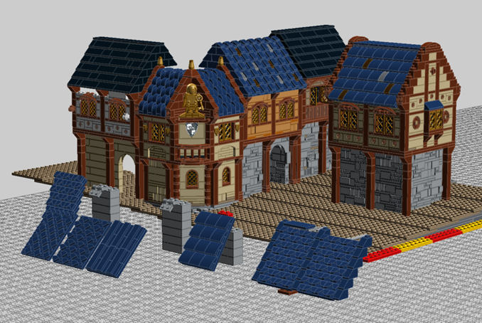
4. More action above the ground level.
Above the armies, nothing happens. To have some minifigs reaction to the events below or maybe a fire breaking out above the evil army could have elevated the build a bit.
This didn’t happen because of lack of time and imagination.
5. Brick built background.
Adding a brick build background would have been cool. Like a sky that would be blue above the good minifigs and dark grey with lightning above the bad ones. Something to further hammer in that this is suppose to be a battle between good and evil.
I did incorporate this idea with the houses though. The second floor on the buildings are build with brighter colors on the good side than on the bad side. White and Tan versus Medium Nougat and Dark Tan.
What I’m satisfied with
To not end with lots of negativity, I’ll mention two thing I’m happy with
One day I might do a rebuild of this idea or portray a different part of the city. I will at least try to incorporate the above ideas in future builds.
/Henrik
